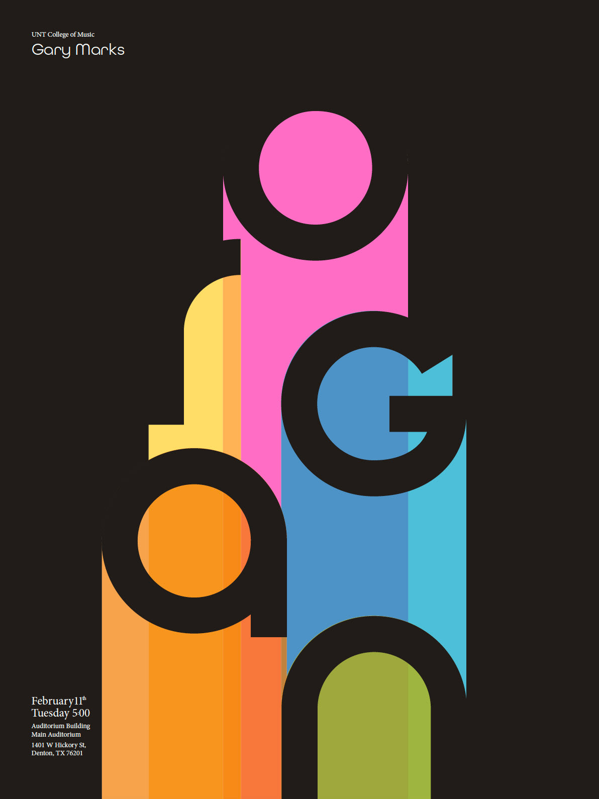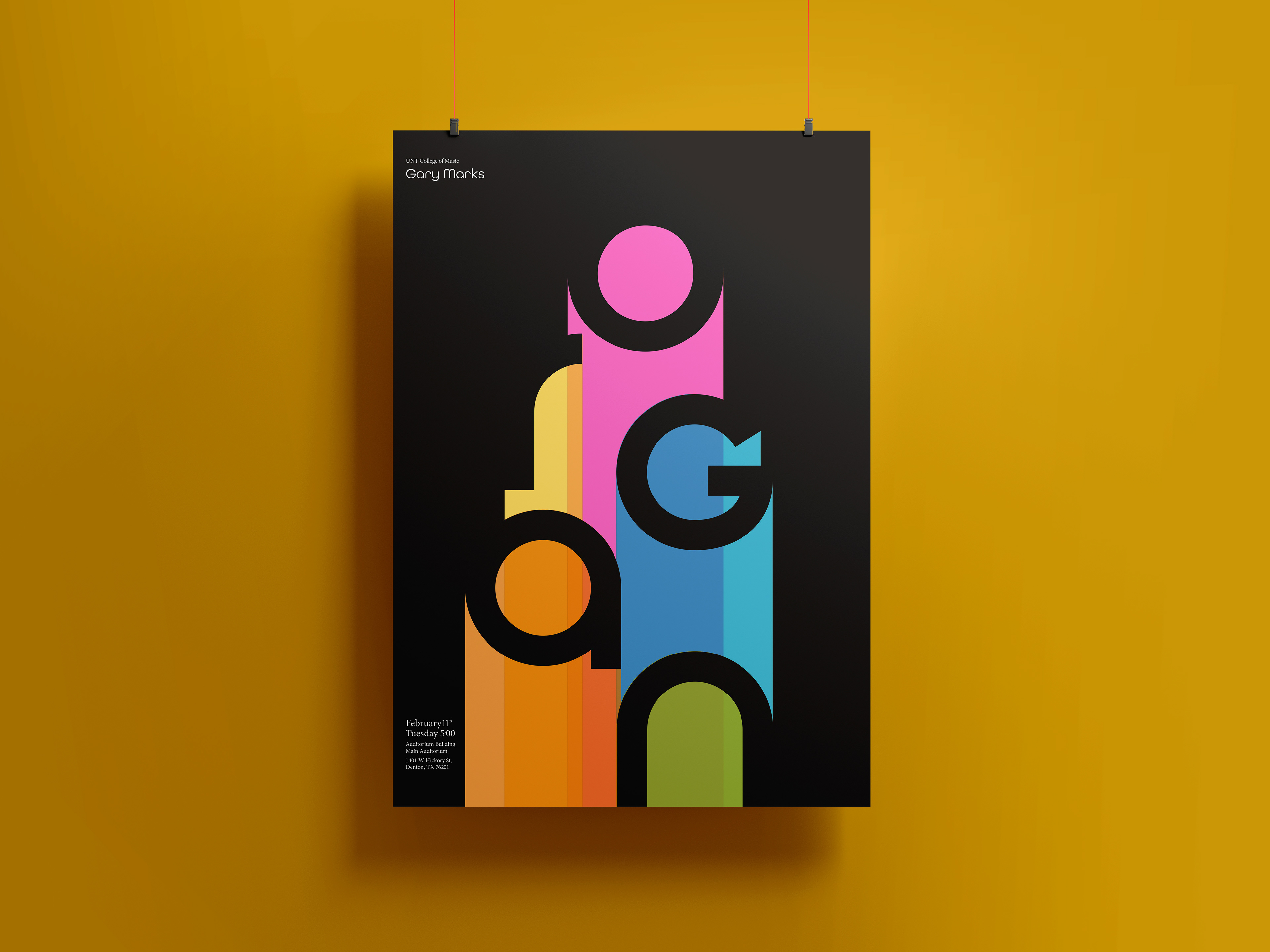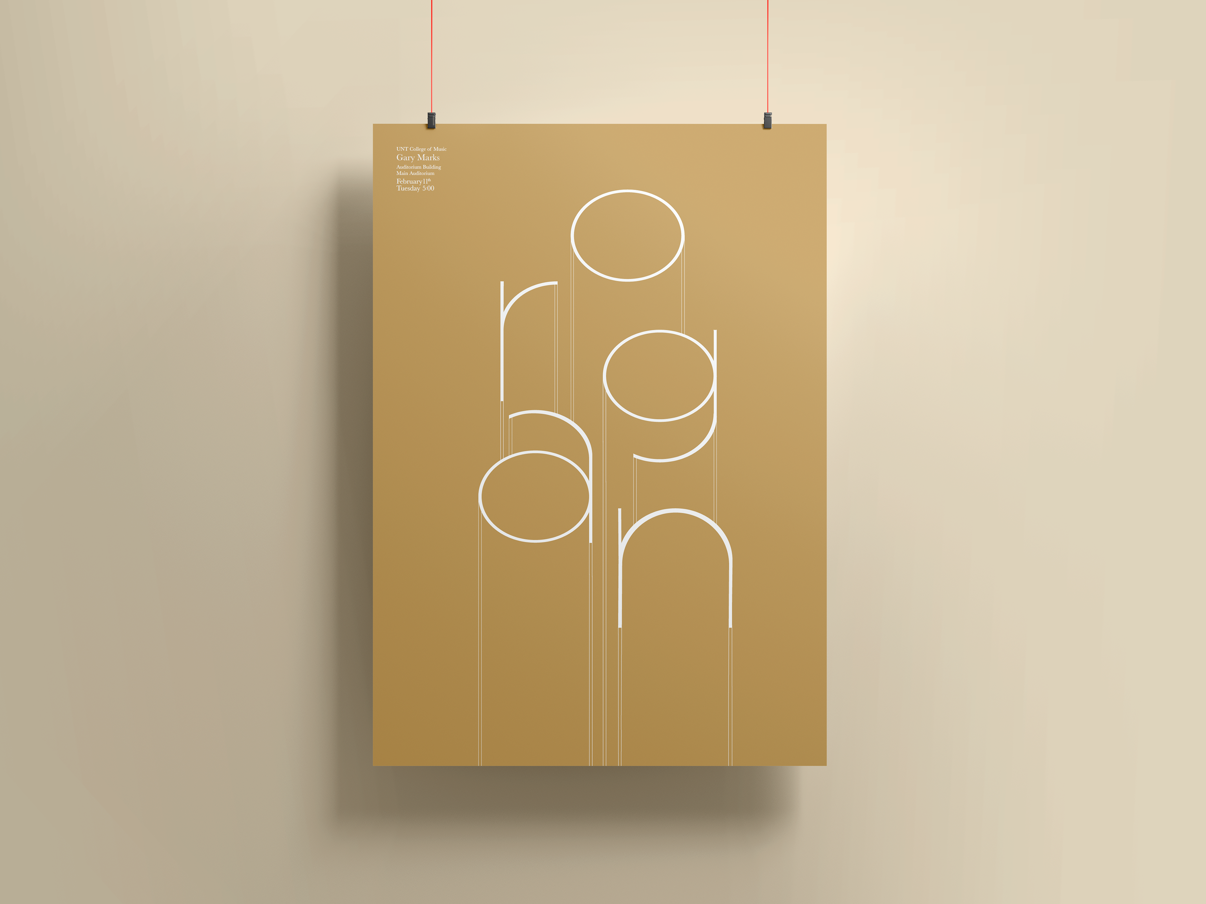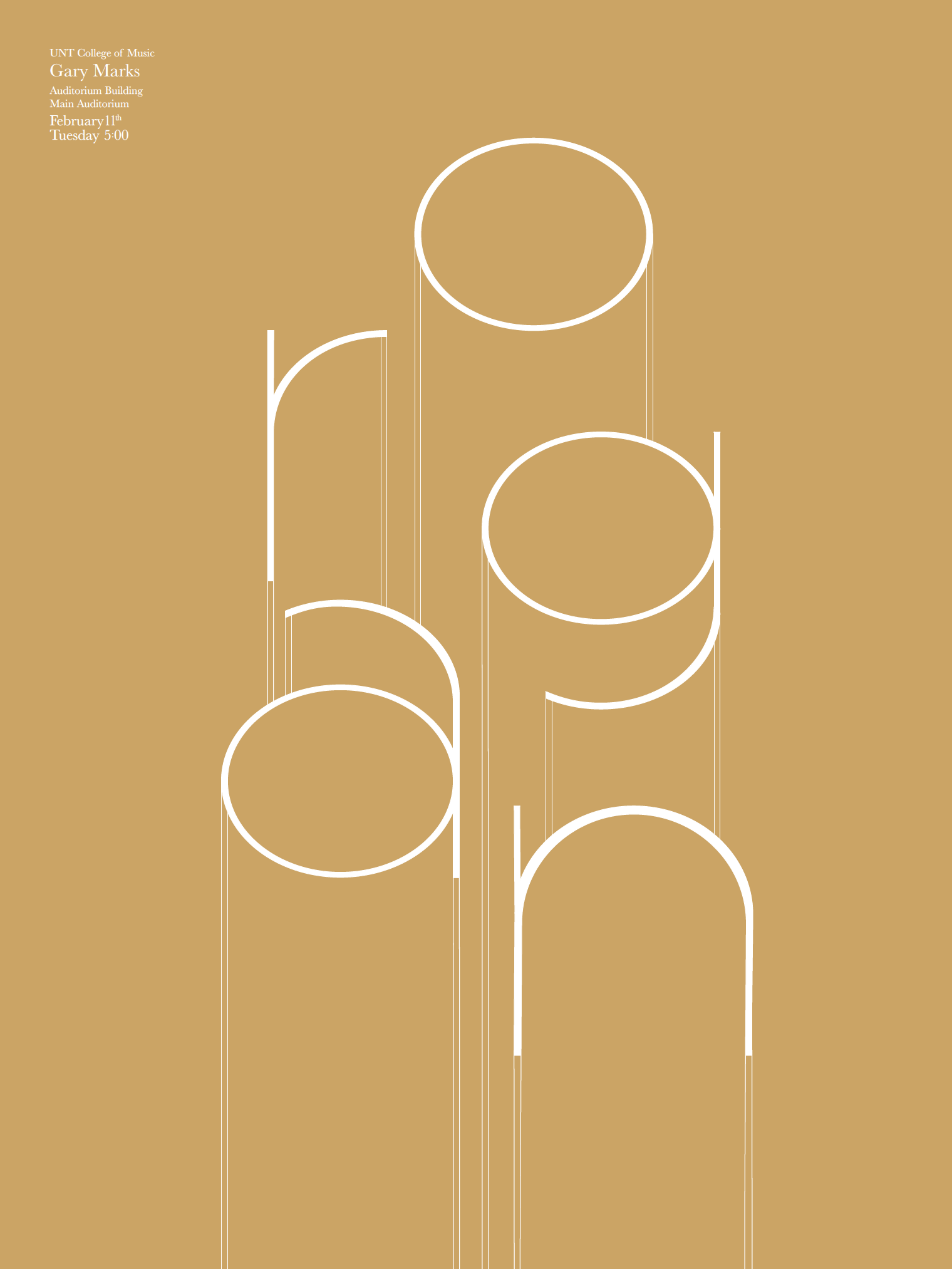


Mock event poster I made for an Organ Recital. The design echos the shape of the unique instruments' pipes. The text descends in a vertical direction to spell out the word organ. There are two versions I created. The first version is to emphasize the typical shiny and brass material the organ is made of with a classy feel the music gives off. In the next version, I decided to use bright colors on a rich brown color to call out the lower wooden portion of the piano. The colors then portray the rich sounds that are expelled when the instrument is played. I eventually would like to create a series of posters based off of these design concepts using various different instruments.
